In web development, the blurred background image effect is a popular design technique where an image used as a background is intentionally blurred. This creates a soft, out-of-focus backdrop that can make overlaid content (like text or other elements) stand out more clearly. This effect is often used to add visual interest and depth to a webpage without overwhelming the main content.
The point here is to use the
backdrop-blur-*or theblur-*utility class.
The two examples below show you two different ways to create blurry background images with Tailwind CSS.
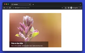
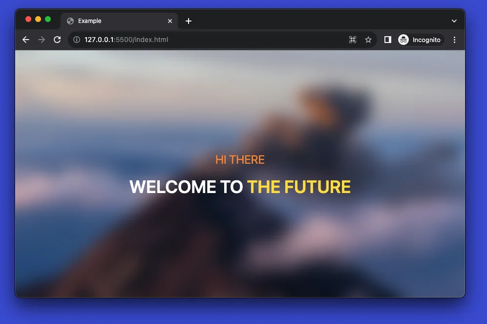
Example 1
Screenshot:
The code:
 <html lang="en">

<head>
    <meta charset="UTF-8">
    <meta name="viewport" content="width=device-width, initial-scale=1.0">
    <script src="https://cdn.tailwindcss.com"></script>
    <title>Example</title>
</head>

<body>
    <div
        class="w-full h-screen bg-[url('https://www.khueapps.com/media/images/2025-02/3.webp')] bg-cover bg-center">
        <div class="w-full h-full flex flex-col justify-center items-center backdrop-blur-lg">
            <h3 class="text-2xl text-orange-400">HI THERE</h3>
            <h1 class="mt-5 text-center text-4xl text-white font-semibold">WELCOME TO
                <span class="text-yellow-300">THE FUTURE</span>
            </h1>
        </div>
    </div>
</body>

</html>
We use the backdrop-blur-lg utility class to create the blur effect.
Example 2
Screenshot:
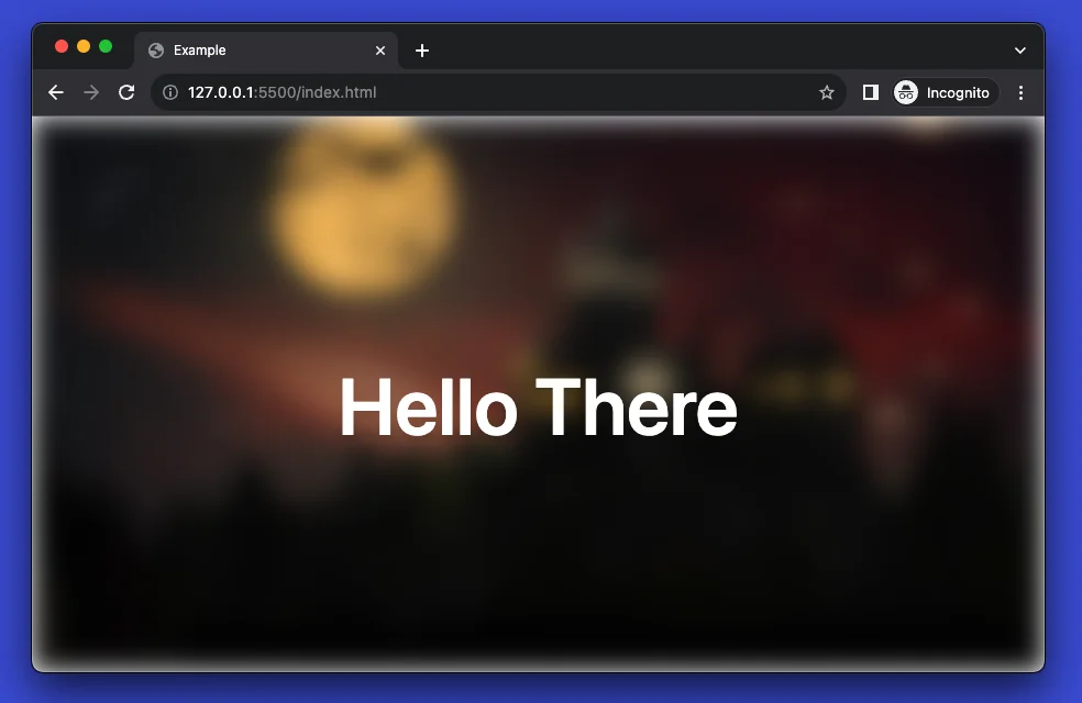
The full source code (including HTML boilerplate):
<html lang="en">

<head>
    <meta charset="UTF-8">
    <meta name="viewport" content="width=device-width, initial-scale=1.0">
    <script src="https://cdn.tailwindcss.com"></script>
    <title>Example</title>
</head>

<body>
    <div class="relative w-full h-screen">
        <div
            class="w-full h-full bg-[url('https://www.khueapps.com/media/images/2025-02/2-2.webp')] bg-cover bg-center blur-md">
        </div>
        <div
            class="absolute top-1/2 left-1/2 -translate-x-1/2 -translate-y-1/2 flex flex-col justify-center items-center">
            <h1 class="mt-5 text-center text-7xl text-white font-semibold">
                Hello There
            </h1>
        </div>
    </div>
</body>

</html>
We use the blur-md utility class to make the blur effect.